“Show me the charts, and I’ll tell you the news.”
Bernard Baruch
With the information overload nowadays and AI tools to rapidly collect the data you’re after with a click of the button, this begs the question: What stats should we focus on?
Amidst the noise on social media and major announcements in the space, particularly with the hype surrounding spot altcoin ETFs, the US Strategic Bitcoin Reserve, and the latest updates on which companies are buying BTC, many often overlook the important Bitcoin and crypto charts.
Today, we’ll cover which ones you should follow to help you identify important crypto trends well before the masses, to make substantial profits in this asset class.
Let’s get into it, in no set order.
U.S. Dollar Index (DXY)
The “Dixie” measures the strength of the USD compared to a range of six major currencies: the Euro, Japanese Yen, British Pound, Canadian Dollar, Swedish Krona, and the Swiss Franc.
How does this relate to Bitcoin? In general, when the DXY is up, it’s usually bearish for BTC, and vice versa. MacroMicro illustrates this through its Bitcoin vs DXY historical chart.
Crypto reserves on centralised exchanges
Savvy crypto investors will regularly pay attention to this trend to gauge price trends and market sentiment, particularly from whales and other large wallets.
As reserves for a digital asset drop, it typically indicates a lower likelihood of people selling crypto, instead opting to move their digital assets to non-custodial wallets.
Conversely, when the amount of BTC available on CEXes increases, it often means that holders are preparing to sell.
The latest situation is very bullish for Bitcoin holders. The Bitcoin exchange balance across all CEXes is at 2.5 million BTC. This figure has been steadily dropping since 2024, and is the lowest it’s been since October 2018.
CryptoQuant, Glassnode and MacroMicro offer charts showing this information across varying time periods.
The Block has also published cryptocurrency monthly exchange volumes since May 2017, breaking down the stats for over 35 of the largest CEXes worldwide.
All of this data about exchange reserves still doesn’t paint the full picture. It’s important to remember that there are 2.54 BTC on exchanges, down from 3.3 million three years ago.
Keep in mind that much of this is inactive, as millions of Bitcoin holders park their BTC on these platforms and do not move the funds.
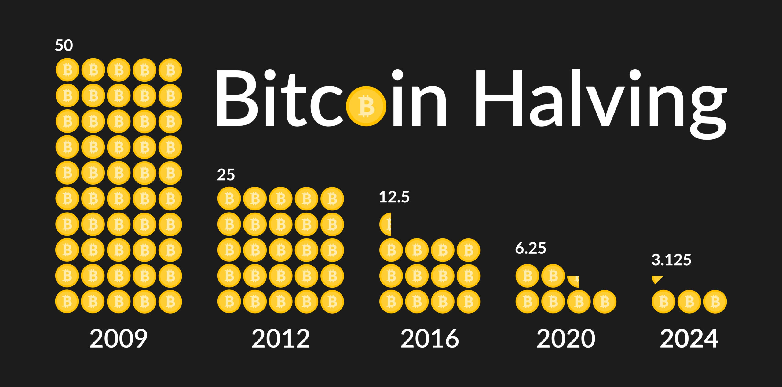
This will only intensify as the asset continues growing in value and global scope, alongside the intensifying supply crunch due to the Bitcoin block reward halving after every 210,000 blocks (approximately 3.5 to 4 years apart).
This is where the following category comes into play.
Bitcoin Long-Term Holder Supply, and Dormant vs Active BTC Holdings
Classifying “Long-term” holdings is very subjective and will vary widely depending on time horizons.
If I had to assign a timeframe to fit this description, I would say four years, as it is still a relatively new asset.
This will be dragged out to five, six and eventually ten consecutive years of BTC being left untouched.
Some metrics track activity from Satoshi-era wallets, specifically those between 2009 and 2011, when Satoshi Nakamoto was still posting about Bitcoin.
Now that there’s been a gradual flush-out of inexperienced and overly emotional retail investors, replaced by a much higher concentration of institutional investors and long-term retail holders (a.k.a., smart money), I am expecting long-term holdings to remain high, especially as “Bitcoin staking” becomes more established in the coming years.
Speaking of corporations holding BTC, this leads me to the next set of data to monitor.
Bitcoin and Ethereum ETF net flows
This category has been one of the most closely monitored crypto data sets since the US SEC’s approval of several spot Bitcoin ETFs in January 2024.
For now, the focus is on the top two. Over the past two months, much attention has been directed to Ethereum, which has even outpaced Bitcoin inflows for brief periods.
Visit the following links to see the latest stats regarding BTC and ETH net flows:
— CoinMarketCap Cryptocurrency ETF Tracker
— Fairside Investors’ Ethereum ETF flows
— CoinGlass’ Bitcoin Spot ETF stats
By the time many of you’re reading this, we’ll likely have spot Solana, XRP and other crypto ETFs.
Before proceeding, it’s essential to distinguish between publicly listed companies’ holdings of BTC and ETH and those of spot ETF providers.
There is a cohort of retail investors who might still be inclined to panic sell or FOMO into crypto via these ETF issuers, rather than playing the long game, like Strategy, Metaplanet or Bitmine Immersion Technologies.
Bitcoin Treasuries and Strategic ETH Reserve (SΞR) provide the most comprehensive, updated data about the largest publicly-owned companies’ ownership of these two digital assets.
Global M2 vs Bitcoin’s Price/Market Cap
There is a moderately strong correlation between the global M2 money supply and Bitcoin’s price, especially since early 2020, albeit with a 2–3-month delay at times.
For the uninitiated, M2 refers to money that includes cash, checking deposits, savings accounts, and readily convertible near-money assets such as retail investors’ certificates of deposit (CDs) and mutual funds.
Data up to July 2025 show a worldwide M2 of up to $123 trillion, including $95 trillion across the world’s four largest central banks (the United States, Europe, Japan, and China) and $22 trillion just within the US.
This figure is at an all-time high in the US and will only continue to grow as the Federal Reserve eventually lowers interest rates and reactivates the money printer. It’s a similar story across the globe.
Realised Bitcoin Market Cap (RBMC)
This measures Bitcoin’s value based on the last price each coin was moved, showing what investors paid, not just today’s price times supply.
It helps recognise when the market is overheated (prices well above the RBMC) or undervalued (prices around or under the RBMC).
Earlier this month, the RBMC hit $1 trillion for the first time, compared to the circulating MC of $2.26 trillion.
This is considered a more useful indicator of Bitcoin’s price performance because it disregards dormant BTC (such as those associated with lost private keys), particularly coins bought before 2017, when the commodity was still below $1000 and when many more newly-mined coins entered circulation compared to today.
Crypto Fear and Greed Index
The Crypto Fear and Greed Index represents a number from 0 (extreme fear) to 100 (extreme greed), providing us with daily updates of the market since its inception in February 2018.
Why is this helpful info?
It’s an indicator for gauging market sentiment and can help determine suitable times to buy and sell.
It’s one of many statistics to focus on, but it only provides basic (yet useful) information. It’s ideal for retail investors who aren’t very interested in technical analysis but still want to be ahead of the average person jumping into the market without any idea of what they’re doing.

at Shutterstock
If you prefer TA, the next chart is one to add to your list.
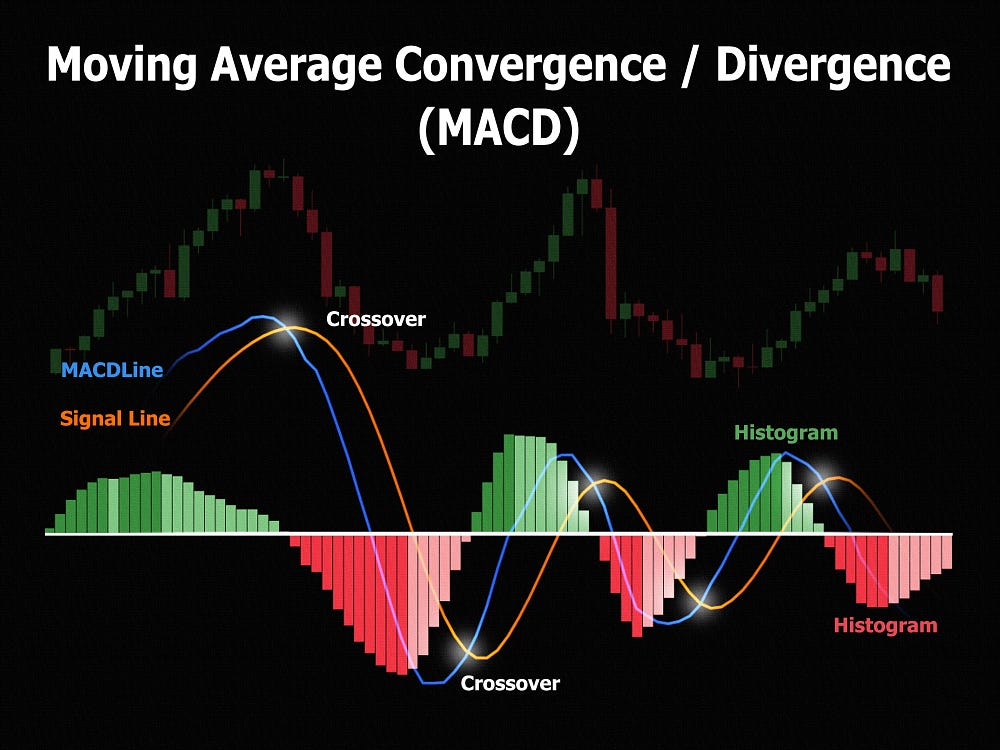
Moving average convergence/divergence (MACD)
MACD demonstrates how strong a trend is by comparing two exponential moving averages (EMAs), helping us determine when to buy, sell, or expect a change.
There are three major parts to consider:
— The MACD Line, involving the difference between a 12-period (minutes, hours, days, weeks, etc) EMA and the 26-period EMA.
This is determined using the following formula:
MACD Line=EMA12−EMA26
— The Signal Line represents the 9-bar EMA of the MACD Line, indicating potential buy and sell points.
— The histogram, which measures the gap between these two lines.
When the MACD line moves above the signal line, it suggests bullish momentum. On the other hand, when the MACD line dips below the signal line, it points to a bearish signal.
This post from Cointree delves further into the specifics of MACD technical analysis in crypto.
at Shutterstock
BTC vs ETH
Those who aren’t that into crypto will exclusively look at BTC, ETH and altcoin price performance solely in relation to fiat currencies, mostly USD.
Seasoned investors, on the other hand, will consider this and BTC vs cryptocurrencies, notably BTC vs ETH.
Whenever one’s having on a complete tear while the other’s barely moving, you’ll be seeing plenty of crypto commentators (myself included) throwing charts around about how well BTC’s performing vs other digital assets.
Here’s the latest situation between the top two.

. Snapshot taken on 25 August 2025.
Why is this significant? Many altcoins still move in sync with Ethereum, albeit to a lesser extent than previous cycles.
In other words, how ETH is performing against BTC indicates whether we’re still in Bitcoin Season or moving to altcoin season.
Mind you, many alts can still pump even if BTC or ETH are barely moving.
Spent Output Profit Ratio (SOPR)
SOPR is a popular on-chain metric for measuring Bitcoin profitability.
Devised by Renato Shirakashi in April 2019, it’s the ratio of the price sold divided by the purchase price, for all Bitcoin trades done in a given period, usually daily.
It’s best to look at adjusted SOPR (aSOPR), which ignores all transactions that last less than one hour and removes short-term transfers, often between wallets, that don’t show real profit or loss.
For comprehensive data since 2011, check out Bitbo’s SOPR chart overlaid with Bitcoin’s price.
Relative Strength Index (RSI)
This popular metric measures the speed and extent of recent price movements for a particular asset, shown on a scale of 0 to 100.
An RSI below 30 indicates the asset is oversold, presenting a good buying opportunity. On the other hand, a value above 70 indicates a strong likelihood of an upcoming price correction.
It’s a popular charting tool and one of the many free options available through your preferred financial analysis platform.
For a more comprehensive analysis of daily market sentiment, I would be more inclined to use the Crypto Fear and Greed Index, which considers market volatility and volume, Google Trends, social media sentiment and Bitcoin dominance more than the standalone RSI indicator.
Notable mentions
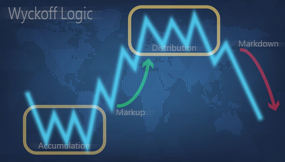
Wyckoff Chart (for Bitcoin)
The Wyckoff chart is a TA tool that helps identify accumulation and distribution phases in the market. It focuses on the relationship between supply and demand, focusing on the behaviour of institutional investors, to predict potential price movements.
Based on the Wyckoff method, Bitcoin’s price cycle can be split into four stages: accumulation, markup, distribution, and markdown.
Zooming out and putting everything into perspective, particularly by considering all of the abovementioned tools, helps us determine where we are on the cycle to make the most profitable decisions, especially if you’re in Bitcoin or crypto for the medium- to long-term.
at Shutterstock
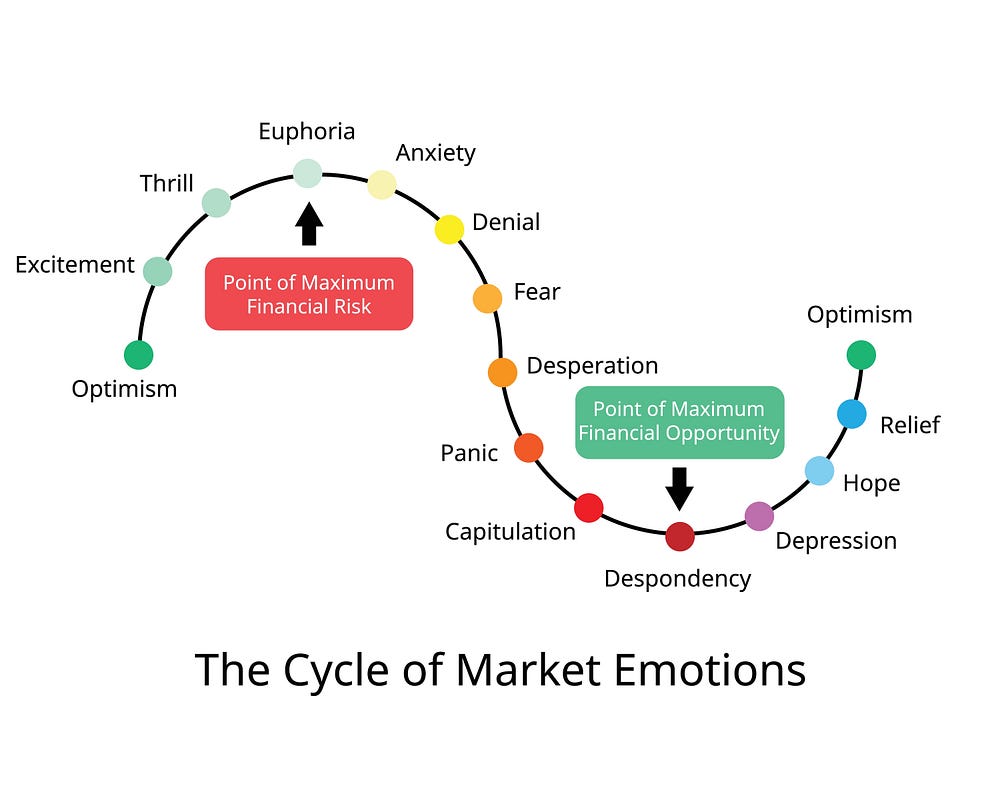
Wall Street Cheat Sheet: The Psychology of Market Cycles
at Shutterstock. There is a more detailed and
of this chart, but I have opted for this for copyright reasons.
If I had to ascertain where we’re at right now, it would be somewhere between optimism and excitement.
For those of you who are still new to crypto and other forms of volatile investments, remember that good buying opportunities still present themselves even during periods of relative excitement.
The most relevant example of late is the market-wide drop in April, with plenty of concerns surrounding Trump’s tariffs amid other geopolitical tensions. That month, BTC dropped to $74,000 and ETH plummeted to $1,400.
What other charts are worth mentioning here? Comment below.
P.S. I highly recommend checking out Bitcoin: Insights and Market Trends 2025, a joint publication by CME Group and Glassnode.
Affiliate links
If you’d like to purchase a Ledger or Trezor product, please use the following link to help support my channel. I receive a small commission per sale at no additional cost.
You might also be interested in these stories:
Disclaimers
• N.B. None of this is financial advice; I am not a financial advisor. You are ultimately responsible for your investments.
• My opinions in this piece may not reflect those of any news outlet, person, organisation, or other entity listed here.
• Please do your due diligence before investing in any crypto assets, staking, NFTs, or other products associated with this space.
Featured image by DUSAN ZIDAR at Shutterstock.